定义
层叠样式表(Cascading Style Sheet,简称:CSS)是为网页添加样式的代码。
1. CSS 基础概念
1.1 什么是 CSS
CSS(Cascading Style Sheets,层叠样式表)是一种样式表语言,用于描述 HTML 或 XML 文档的表现。它不是编程语言,而是描述性的样式规则语言。
核心特点:
- 层叠性:多个样式规则可以叠加应用
- 继承性:子元素可以继承父元素的样式
- 选择性:通过选择器精确定位元素
- 分离性:将样式与内容分离
1.2 CSS 的发展历程
- CSS1 (1996):基础样式属性(字体、颜色、间距)
- CSS2 (1998):定位、媒体查询、表格样式
- CSS2.1 (2011):修正和完善,成为事实标准
- CSS3 (2011至今):模块化发展,包含动画、变形、网格、弹性布局等
- CSS4 (发展中):更多高级特性的规划
1.3 CSS 的作用和价值
/* 示例:为段落添加样式 */
p {
  color: red;
  font-size: 16px;
  line-height: 1.5;
  margin: 16px 0;
}
CSS 主要职责:
- 视觉表现:控制网页的外观、布局和动画
- 用户体验:创建美观、易用的界面
- 响应式设计:适配不同设备和屏幕尺寸
- 性能优化:通过合理的样式优化页面渲染性能
1.4 CSS 引入方式
<!-- 1. 外部样式表(推荐) -->
<link href="styles/style.css" rel="stylesheet">

<!-- 2. 内部样式表 -->
<style>
  p {
    color: red;
  }
</style>

<!-- 3. 内联样式(特殊情况使用) -->
<p style="color: red;">红色文字</p>

<!-- 4. @import 导入(在CSS文件中) -->
@import url("reset.css");
@import url("layout.css");
引入方式优先级: 内联样式 > 内部样式 > 外部样式 > 浏览器默认样式
最佳实践:
- 优先使用外部样式表,便于维护和缓存
- 内联样式仅用于特殊情况和动态样式
- 合理使用 @import,避免过多层级
2. 规则集详解
让我们来仔细看一看上述 CSS: 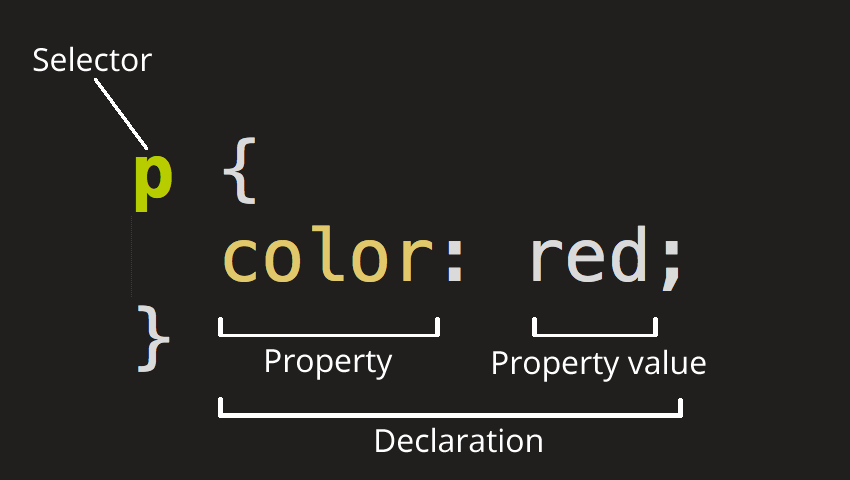 整个结构称为 规则集(通常简称“规则”),各部分释义如下:
选择器(Selector) HTML 元素的名称位于规则集开始。它选择了一个或多个需要添加样式的元素(在这个例子中就是 p 元素)。要给不同元素添加样式只需要更改选择器就行了。
声明(Declaration) 一个单独的规则,如 color: red; 用来指定添加样式元素的属性。
属性(Properties) 改变 HTML 元素样式的途径。(本例中 color 就是
<p>元素的属性。)CSS 中,由编写人员决定修改哪个属性以改变规则。属性的值(Property value) 在属性的右边,冒号后面即属性的值,它从指定属性的众多外观中选择一个值(我们除了 red 之外还有很多属性值可以用于 color )。
注意其他重要的语法:
- 每个规则集(除了选择器的部分)都应该包含在成对的大括号里({})。
- 在每个声明里要用冒号(:)将属性与属性值分隔开。
- 在每个规则集里要用分号(;)将各个声明分隔开。
3. CSS 选择器详解
3.1 基础选择器
/* 1. 元素选择器(类型选择器) */
p { color: blue; }           /* 选择所有 <p> 元素 */
div { margin: 10px; }         /* 选择所有 <div> 元素 */

/* 2. 类选择器 */
.highlight { background: yellow; }     /* 选择 class="highlight" 的元素 */
.card { border: 1px solid #ccc; }      /* 选择 class="card" 的元素 */

/* 3. ID 选择器 */
#header { background: #f0f0f0; }    /* 选择 id="header" 的元素 */
#main-content { padding: 20px; }      /* 选择 id="main-content" 的元素 */

/* 4. 通用选择器 */
* { box-sizing: border-box; }    /* 选择所有元素 */
3.2 组合选择器
/* 1. 后代选择器(空格) */
div p { margin-left: 20px; }    /* 选择 div 内的所有 p 元素 */
article .content { color: #333; }  /* 选择 article 内的 .content 元素 */

/* 2. 子选择器(>) */
ul > li { list-style-type: none; }    /* 选择 ul 的直接子元素 li */
nav > a { text-decoration: none; }      /* 选择 nav 的直接子元素 a */

/* 3. 相邻兄弟选择器(+) */
h2 + p { margin-top: 0; }    /* 选择紧跟在 h2 后的 p 元素 */

/* 4. 通用兄弟选择器(~) */
h2 ~ p { color: #666; }    /* 选择 h2 之后的所有 p 兄弟元素 */
3.3 属性选择器
/* 基础属性选择器 */
[disabled] { opacity: 0.6; }              /* 有 disabled 属性的元素 */
[type="text"] { border: 1px solid #ccc; } /* type="text" 的输入框 */

/* 属性值匹配 */
[class~="active"] { font-weight: bold; }     /* class 包含 "active" */
[lang|="zh"] { quotes: "«" "»"; }          /* lang 以 "zh" 开头 */

/* 属性值开头/结尾/包含 */
[href^="https"] { color: green; }    /* href 以 "https" 开头 */
[href$=".pdf"] { font-weight: bold; }  /* href 以 ".pdf" 结尾 */
[class*="button"] { cursor: pointer; } /* class 包含 "button" */

/* 大小写敏感 */
[class^="nav" i] { background: #f0f0f0; }  /* 不区分大小写 */
3.4 伪类选择器
/* 动态伪类 */
a:hover { color: red; }           /* 鼠标悬停 */
a:active { transform: scale(0.98); } /* 激活状态 */
a:focus { outline: 2px solid blue; }  /* 获得焦点 */

/* 结构性伪类 */
:first-child { font-weight: bold; }    /* 第一个子元素 */
:last-child { margin-right: 0; }     /* 最后一个子元素 */
:nth-child(2n) { background: #f0f0f0; } /* 偶数子元素 */
:nth-child(odd) { background: #f9f9f9; } /* 奇数子元素 */
:nth-of-type(3) { color: red; }      /* 第三个同类型元素 */

/* 表单伪类 */
:required { border-color: red; }      /* 必填字段 */
:valid { border-color: green; }       /* 验证通过 */
:invalid { border-color: red; }       /* 验证失败 */
:disabled { opacity: 0.6; }        /* 禁用状态 */

/* 否定伪类 */
:not(.active) { display: none; }   /* 不含 active 类的元素 */
:not([disabled]) { cursor: pointer; } /* 非禁用状态 */
3.5 伪元素选择器
/* 文本相关伪元素 */
::before { content: "▶"; }         /* 元素前插入内容 */
::after { content: "◀"; }          /* 元素后插入内容 */
::first-line { font-weight: bold; }   /* 第一行文本 */
::first-letter { font-size: 2em; }   /* 第一个字母 */

/* 选择器伪元素 */
::selection { background: yellow; }     /* 用户选中的文本 */
::placeholder { color: #999; }        /* 占位符文本 */
3.6 选择器优先级(特异性)
/* 优先级计算:行内样式(1000) > ID(100) > 类/伪类(10) > 元素(1) */

/* 低优先级 */
p { color: blue; }                    /* 优先级: 1 */

/* 中等优先级 */
.content p { color: green; }           /* 优先级: 11 */
#main p { color: red; }               /* 优先级: 101 */

/* 高优先级 */
#main .content p { color: purple; }   /* 优先级: 111 */

/* !important 具有最高优先级(谨慎使用) */
p { color: orange !important; }        /* 覆盖所有优先级 */
3.7 选择器性能优化
/* ✅ 优化:从右到左解析效率高 */
/* 浏览器先找到所有 p,再检查是否有 .highlight 祖先 */
.highlight p { color: red; }

/* ❌ 避免:过于具体的选择器 */
body div.main article.post div.content p.text {
    /* 优先级过高,难以维护 */
}

/* ✅ 推荐:语义化类名 */
.post-content { color: #333; }
.post-meta { color: #666; }

/* ✅ 优化:减少通用选择器使用 */
* { margin: 0; padding: 0; }     /* 必要时才使用 */
3.8 现代选择器
/* :is() 和 :where() */
:is(section, article) :is(h1, h2) { margin-top: 1em; }
:where(section, article) :where(h1, h2) { margin-top: 1em; } /* 优先级为 0 */

/* :has() 父选择器 */
section:has(> h2) { border-top: 2px solid #333; } /* 包含 h2 子元素的 section */

/* CSS 变量与选择器结合 */
:root {
    --primary-color: #007bff;
    --secondary-color: #6c757d;
}

.btn-primary { background-color: var(--primary-color); }
.btn-secondary { background-color: var(--secondary-color); }
4. CSS 盒子模型
4.1 盒子模型概述
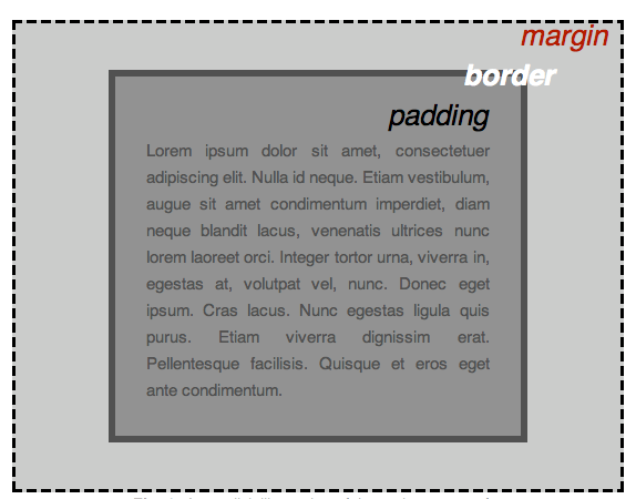
编写 CSS 时你会发现,大部分工作都是围绕着"盒子"展开的——设置尺寸、颜色、位置等。页面中几乎所有 HTML 元素都可以被看作若干层叠的盒子。
CSS 布局主要就是基于盒模型的。每个占据页面空间的元素都有以下属性:
- Content(内容):元素的实际内容,如文本、图片等
- Padding(内边距):围绕内容的空间,在边框内部
- Border(边框):紧接着内边距的线,包围内容和内边距
- Margin(外边距):围绕元素外部的空间,在边框外部
4.2 标准盒模型 vs IE 盒模型
/* 标准盒模型(W3C box-model)*/
div {
    width: 200px;
    padding: 20px;
    border: 10px solid #ccc;
    margin: 15px;
    box-sizing: content-box; /* 默认值 */
}

/* 实际占用宽度 = width(200) + padding(40) + border(20) + margin(30) = 290px */
/* 实际内容宽度 = 200px */

/* IE 盒模型(怪异模式)*/
div {
    width: 200px;
    padding: 20px;
    border: 10px solid #ccc;
    margin: 15px;
    box-sizing: border-box;
}

/* 实际占用宽度 = width(200) + margin(30) = 230px */
/* 实际内容宽度 = 200 - padding(40) - border(20) = 140px */
4.3 Box-sizing 属性
/* 推荐的最佳实践 */
*, *::before, *::after {
    box-sizing: border-box; /* 统一使用 border-box */
}

/* 或者在特定元素上使用 */
.form-input {
    box-sizing: border-box;
    width: 100%;
    padding: 10px;
    border: 1px solid #ccc;
    /* 总宽度不会超出父容器 */
}
Box-sizing 取值:
content-box(默认):width 只包含内容区域border-box:width 包含内容、内边距和边框padding-box:width 包含内容和内边距(已废弃)
4.4 外边距(Margin)
/* 单个方向设置 */
.margin-example {
    margin-top: 10px;
    margin-right: 20px;
    margin-bottom: 10px;
    margin-left: 20px;
}

/* 简写形式 */
.margin-example {
    margin: 10px 20px;  /* 上右下左 = 10px 20px 10px 20px */
    margin: 10px 15px 20px;  /* 上10px 左右15px 下20px */
    margin: 10px 15px 20px 25px;  /* 上10px 右15px 下20px 左25px */
}

/* 自动值居中 */
.center-block {
    width: 600px;
    margin: 0 auto;  /* 上下0 左右自动 */
}

/* 负外边距 */
.pull-left {
    margin-left: -20px;  /* 向左拉 */
}
4.5 内边距(Padding)
/* 单个方向设置 */
.padding-example {
    padding-top: 10px;
    padding-right: 20px;
    padding-bottom: 10px;
    padding-left: 20px;
}

/* 简写形式 */
.padding-example {
    padding: 10px 20px;  /* 上右下左 = 10px 20px 10px 20px */
    padding: 10px 15px 20px;  /* 上10px 左右15px 下20px */
    padding: 10px 15px 20px 25px;  /* 上10px 右15px 下20px 左25px */
}

/* 百分比内边距 */
.responsive-padding {
    padding: 5%;  /* 相对于父元素的宽度 */
}
4.6 边框(Border)
/* 基础边框 */
.border-example {
    border: 2px solid #ff6b6b;
}

/* 分开设置 */
.border-detailed {
    border-width: 2px;
    border-style: solid;
    border-color: #4ecdc4;
}

/* 单个边框 */
.border-sides {
    border-top: 3px dashed red;
    border-right: 2px dotted blue;
    border-bottom: 1px solid green;
    border-left: 4px double orange;
}

/* 圆角边框 */
.border-radius {
    border-radius: 8px;  /* 四个角都是8px */
}

.border-radius-detailed {
    border-top-left-radius: 10px;
    border-top-right-radius: 20px;
    border-bottom-right-radius: 30px;
    border-bottom-left-radius: 40px;
}

/* 圆形元素 */
.circle {
    width: 100px;
    height: 100px;
    border-radius: 50%;  /* 正圆 */
    background-color: #ff6b6b;
}
4.7 外边距折叠(Margin Collapse)
/* 相邻兄弟元素的外边距折叠 */
.box1 {
    margin-bottom: 20px;
}
.box2 {
    margin-top: 30px;
    /* 实际间距是 max(20, 30) = 30px */
}

/* 父子元素外边距折叠 */
.parent {
    background: #f0f0f0;
    margin-top: 50px;
}
.child {
    margin-top: 30px;
    /* 父元素的上外边距被子元素"撑大" */
}

/* 解决外边距折叠的方法 */
.parent {
    background: #f0f0f0;
    padding-top: 1px;  /* 方法1:添加内边距 */
    border-top: 1px solid transparent;  /* 方法2:添加边框 */
    overflow: hidden;  /* 方法3:触发 BFC */
}
.child {
    margin-top: 30px;
}
4.8 可见性属性
/* Overflow 属性 */
.overflow-visible {
    overflow: visible;  /* 默认,内容可能溢出 */
}

.overflow-hidden {
    overflow: hidden;   /* 隐藏溢出内容 */
}

.overflow-scroll {
    overflow: scroll;   /* 始终显示滚动条 */
}

.overflow-auto {
    overflow: auto;     /* 需要时显示滚动条 */
}

/* 单独方向设置 */
.overflow-xy {
    overflow-x: hidden;   /* 水平方向隐藏溢出 */
    overflow-y: auto;     /* 垂直方向自动滚动 */
}

/* Visibility 属性 */
.visibility-hidden {
    visibility: hidden;  /* 隐藏但保留空间 */
}

.visibility-visible {
    visibility: visible;  /* 显示 */
}

/* Display 属性 */
.display-none {
    display: none;  /* 完全移除,不保留空间 */
}

.display-block {
    display: block;  /* 块级元素 */
}

.display-inline {
    display: inline;  /* 行内元素 */
}

.display-inline-block {
    display: inline-block;  /* 行内块级元素 */
}
5. BFC(块格式化上下文)
5.1 BFC 定义
BFC(Block Formatting Context,块格式化上下文)是 Web 页面可视 CSS 渲染的一部分,是块级盒子布局过程发生的区域,也是浮动元素与其他元素交互的区域。
BFC 本质上是一个独立的渲染环境:
- 内部元素的布局不受外部影响
- 外部元素的布局不受内部影响
- 隔离了浮动元素的相互作用
5.2 BFC 触发条件
以下属性或值会触发 BFC:
/* 1. 浮动元素 */
.float-bfc {
    float: left;
    /* 或 float: right; */
}

/* 2. 绝对定位元素 */
.position-bfc {
    position: absolute;
    /* 或 position: fixed; */
}

/* 3. Display 特定值 */
.display-bfc {
    display: inline-block;
    /* 或 display: table-cell; */
    /* 或 display: flex; */
    /* 或 display: inline-flex; */
    /* 或 display: grid; */
    /* 或 display: flow-root; */ /* 推荐的专门触发方式 */
}

/* 4. Overflow 非 visible */
.overflow-bfc {
    overflow: hidden;
    /* 或 overflow: auto; */
    /* 或 overflow: scroll; */
    /* 或 overflow: clip; */
}
5.3 BFC 特性
/* 特性1:独立的布局环境 */
.bfc-container {
    display: flow-root; /* 触发 BFC */
}

.bfc-child {
    margin: 20px 0; /* 内部元素的边距不会影响到外部 */
}

/* 特性2:垂直方向排列 */
.bfc-vertical {
    /* BFC 内块级元素垂直排列,从顶部开始 */
}

/* 特性3:边距折叠规则 */
.margin-collapse-1 { margin-bottom: 30px; } /* 在同一 BFC 内,相邻边距会折叠 */
.margin-collapse-2 { margin-top: 20px; } /* 实际边距为 max(30, 20) = 30px */

/* 特性4:包含浮动元素 */
.contain-float {
    overflow: hidden; /* 触发 BFC */
    /* BFC 高度会包含浮动元素 */
}

.float-element {
    float: left;
    width: 100px;
    height: 100px;
}
5.4 BFC 实际应用
5.4.1 防止边距折叠
/* ❌ 问题:相邻元素边距折叠 */
.box1 { margin-bottom: 20px; }
.box2 { margin-top: 30px; }  /* 实际间距是 30px,不是 50px */

/* ✅ 解决:创建独立 BFC */
.box2-wrapper {
    overflow: hidden; /* 触发 BFC */
}
.box2 {
    margin-top: 30px;
    /* 现在边距不会折叠,实际间距是 20 + 30 = 50px */
}
5.4.2 清除浮动
/* ❌ 问题:父容器高度不包含浮动子元素 */
.parent {
    /* 高度为 0,因为浮动子元素不参与高度计算 */
}
.float-child {
    float: left;
    width: 100px;
    height: 100px;
}

/* ✅ 解决:父容器创建 BFC */
.parent-bfc {
    overflow: hidden; /* 或 display: flow-root; */
    /* 现在 BFC 会计算浮动子元素的高度 */
}
5.4.3 防止浮动元素覆盖
/* ❌ 问题:浮动元素覆盖后续元素 */
.float-left {
    float: left;
    width: 200px;
    height: 200px;
}
.normal-content {
    /* 内容会被浮动元素覆盖 */
}

/* ✅ 解决:后续元素创建 BFC */
.normal-content-bfc {
    overflow: hidden; /* 触发 BFC */
    /* BFC 区域不会与浮动元素重叠 */
    /* 或者使用 margin-left 清除浮动 */
    margin-left: 200px;
}
5.4.4 两栏布局实现
/* 使用 BFC 实现自适应两栏布局 */
.sidebar {
    float: left;
    width: 200px;
    margin-right: 20px;
    background: #f0f0f0;
}

.main-content {
    overflow: hidden; /* 触发 BFC */
    /* 自动填充剩余空间 */
    background: #ffffff;
    min-height: 400px;
}
5.5 现代方案:display: flow-root
/* 推荐的现代方案 */
.clearfix-modern {
    display: flow-root;
}

/* 传统的 clearfix 技巧(不推荐) */
.clearfix-legacy::after {
    content: "";
    display: table;
    clear: both;
}

/* 对比 */
.legacy-container {
    /* 需要额外代码来处理浮动和边距折叠 */
}
.modern-container {
    display: flow-root;
    /* 自动处理浮动,包含浮动元素,防止边距折叠 */
}
5.6 BFC 性能考虑
/* ✅ 推荐:使用 flow-root */
.bfc-optimal {
    display: flow-root; /* 专门为触发 BFC 设计 */
}

/* ⚠️ 注意:overflow: hidden 可能影响用户体验 */
.bfc-caution {
    overflow: hidden; /* 可能隐藏重要内容 */
}

/* ✅ 好的实践:根据需要选择合适的触发方式 */
.layout-bfc {
    /* 布局相关用 flow-root */
    display: flow-root;
}

.overflow-bfc {
    /* 需要裁剪内容时用 overflow */
    overflow: auto;
    max-height: 300px;
}
6. CSS 预处理器详解
6.1 预处理器概述
CSS 预处理器是扩展了 CSS 功能的程序,它们提供了:
- 变量:便于维护和复用
- 嵌套:更清晰的代码结构
- 混入(Mixins):代码复用机制
- 函数:动态生成样式
- 模块化:更好的代码组织
6.2 Sass/SCSS
// 变量定义
$primary-color: #007bff;
$secondary-color: #6c757d;
$font-size-base: 16px;
$border-radius: 4px;

// 嵌套规则
.card {
    background: white;
    border-radius: $border-radius;
    box-shadow: 0 2px 4px rgba(0,0,0,0.1);

    .card-header {
        padding: 1rem;
        border-bottom: 1px solid #eee;
    }

    .card-body {
        padding: 1rem;
    }
}

// Mixin 定义
@mixin button-style($bg-color, $text-color: white) {
    background-color: $bg-color;
    color: $text-color;
    border: none;
    padding: 0.5rem 1rem;
    border-radius: $border-radius;
    cursor: pointer;

    &:hover {
        background-color: darken($bg-color, 10%);
    }
}

// 使用 Mixin
.btn-primary {
    @include button-style($primary-color);
}

.btn-secondary {
    @include button-style($secondary-color);
}

// 函数
@function rem($pixels) {
    @return ($pixels / 16px) * 1rem;
}

.container {
    width: rem(960px);
    margin: 0 auto;
}

// 条件和循环
@for $i from 1 through 4 {
    .heading-#{$i} {
        font-size: #{$i * 4}px;
        margin-bottom: 0.5rem;
    }
}

@mixin respond-to($breakpoint) {
    @if $breakpoint == mobile {
        @media (max-width: 767px) { @content; }
    } @else if $breakpoint == tablet {
        @media (min-width: 768px) and (max-width: 1023px) { @content; }
    } @else if $breakpoint == desktop {
        @media (min-width: 1024px) { @content; }
    }
}

.sidebar {
    width: 300px;

    @include respond-to(mobile) {
        width: 100%;
    }
}
6.3 Less
// 变量定义
@primary-color: #007bff;
@secondary-color: #6c757d;
@border-radius: 4px;

// 嵌套规则
.card {
    background: white;
    border-radius: @border-radius;

    &__header { // BEM 命名约定
        padding: 1rem;
        border-bottom: 1px solid #eee;
    }

    &__body {
        padding: 1rem;
    }

    &:hover {
        transform: translateY(-2px);
        box-shadow: 0 4px 8px rgba(0,0,0,0.15);
    }
}

// Mixin 定义
.button-style(@bg-color, @text-color: white) {
    background-color: @bg-color;
    color: @text-color;
    border: none;
    padding: 0.5rem 1rem;
    border-radius: @border-radius;

    &:hover {
        background-color: darken(@bg-color, 10%);
    }
}

// 使用 Mixin
.btn-primary {
    .button-style(@primary-color);
}

// 运算
@base-font-size: 16px;
@h1-size: @base-font-size * 2.5;
@h2-size: @base-font-size * 2;
@h3-size: @base-font-size * 1.5;

h1 { font-size: @h1-size; }
h2 { font-size: @h2-size; }
h3 { font-size: @h3-size; }

// 条件逻辑
.responsive(@width) when (@width = mobile) {
    .sidebar {
        width: 100%;
    }
}

.responsive(@width) when (@width = desktop) {
    .sidebar {
        width: 300px;
        float: left;
    }
}

.responsive(mobile);
6.4 Stylus
// 变量定义
primary-color = #007bff
secondary-color = #6c757d
border-radius = 4px
base-font-size = 16px

// 简化的语法(无需括号和分号)
.card
    background white
    border-radius border-radius
    box-shadow 0 2px 4px rgba(0,0,0,0.1)

    .card-header
        padding 1rem
        border-bottom 1px solid #eee

    .card-body
        padding 1rem

// Mixin 定义
button-style(bg-color, text-color = white)
    background-color bg-color
    color text-color
    border none
    padding 0.5rem 1rem
    border-radius border-radius
    cursor pointer

    &:hover
        background-color darken(bg-color, 10%)

// 使用 Mixin
.btn-primary
    button-style(primary-color)

// 函数和循环
create-heading-sizes()
    for i in (1..4)
        .heading-{i}
            font-size (i * 4)px
            margin-bottom 0.5rem

create-heading-sizes()

// 条件判断
responsive(width)
    if width is 'mobile'
        .sidebar
            width 100%
    else if width is 'desktop'
        .sidebar
            width 300px
            float left

responsive('mobile')
6.5 预处理器对比
| 特性 | Sass/SCSS | Less | Stylus |
|---|---|---|---|
| 语法复杂度 | 中等 | 简单 | 最简 |
| 变量前缀 | $ | @ | 无 |
| 嵌套 | 支持 | 支持 | 支持 |
| Mixins | 强大 | 基本 | 强大 |
| 函数 | 丰富 | 基本 | 丰富 |
| 社区 | 最大 | 中等 | 小而精 |
| 工具链 | Ruby/Node.js | Node.js | Node.js |
6.6 现代替代方案
/* 原生 CSS 变量(CSS Custom Properties) */
:root {
    --primary-color: #007bff;
    --secondary-color: #6c757d;
    --border-radius: 4px;
    --base-font-size: 16px;
}

.btn-primary {
    background-color: var(--primary-color);
    color: white;
    border-radius: var(--border-radius);
}

/* 作用域变量 */
.card {
    --card-bg: white;
    background: var(--card-bg);
}

/* 动态修改变量 */
.card-dark {
    --card-bg: #2d3748;
    background: var(--card-bg);
}
7. 现代 CSS 布局
7.1 Flexbox 弹性布局
/* 基础 Flex 容器 */
.flex-container {
    display: flex;

    /* 主轴方向 */
    flex-direction: row;        /* row | row-reverse | column | column-reverse */

    /* 换行设置 */
    flex-wrap: nowrap;         /* nowrap | wrap | wrap-reverse */

    /* 主轴对齐 */
    justify-content: center;     /* flex-start | flex-end | center | space-between | space-around */

    /* 交叉轴对齐 */
    align-items: center;        /* flex-start | flex-end | center | stretch | baseline */

    /* 多行对齐 */
    align-content: center;       /* flex-start | flex-end | center | space-between | space-around */
}

/* Flex 项目属性 */
.flex-item {
    /* 扩展比例 */
    flex-grow: 0;            /* 数字,0表示不扩展 */

    /* 收缩比例 */
    flex-shrink: 1;          /* 数字,1表示会收缩 */

    /* 基础大小 */
    flex-basis: auto;         /* auto | 具体尺寸 */

    /* 简写 */
    flex: 0 1 auto;         /* flex-grow flex-shrink flex-basis */

    /* 单独对齐 */
    align-self: center;        /* 覆容容器的 align-items */
}

/* 实际应用:水平居中 */
.horizontal-center {
    display: flex;
    justify-content: center;
    align-items: center;
    height: 200px;
}

/* 实际应用:垂直居中 */
.vertical-center {
    display: flex;
    flex-direction: column;
    justify-content: center;
    align-items: center;
    height: 200px;
}

/* 实际应用:三栏布局 */
.three-columns {
    display: flex;
}
.sidebar-left {
    flex: 0 0 200px;        /* 固定宽度 */
    background: #f0f0f0;
}
.main-content {
    flex: 1 1 auto;         /* 自适应宽度 */
    background: white;
}
.sidebar-right {
    flex: 0 0 150px;       /* 固定宽度 */
    background: #e9ecef;
}
7.2 Grid 网格布局
/* 基础 Grid 容器 */
.grid-container {
    display: grid;

    /* 定义网格列 */
    grid-template-columns: 1fr 2fr 1fr;    /* 3列,中间宽度是两边的两倍 */
    /* grid-template-columns: 200px 1fr 100px; */ /* 具体像素值 */
    /* grid-template-columns: repeat(3, 1fr); */ /* 重复模式 */

    /* 定义网格行 */
    grid-template-rows: auto 1fr auto;

    /* 定义网格间隙 */
    gap: 20px;                  /* 或分开设置:row-gap, column-gap */

    /* 网格区域命名 */
    grid-template-areas:
        "header header header"
        "sidebar main aside"
        "footer footer footer";
}

/* Grid 项目属性 */
.grid-item {
    /* 放置到指定区域 */
    grid-area: header;          /* 或 grid-row, grid-column */

    /* 单独行列设置 */
    grid-row: 1 / 2;           /* 开始行 / 结束行 */
    grid-column: 1 / 3;         /* 开始列 / 结束列 */

    /* 对齐方式 */
    justify-self: center;          /* 项目自身对齐 */
    align-self: center;
}

/* 实际应用:网格布局示例 */
.layout-grid {
    display: grid;
    grid-template-columns: 200px 1fr 200px;
    grid-template-rows: 80px 1fr 60px;
    grid-template-areas:
        "header header header"
        "sidebar main aside"
        "footer footer footer";
    gap: 20px;
    height: 100vh;
}

.header { grid-area: header; background: #007bff; }
.sidebar { grid-area: sidebar; background: #f8f9fa; }
.main { grid-area: main; background: white; }
.aside { grid-area: aside; background: #e9ecef; }
.footer { grid-area: footer; background: #6c757d; }
8. CSS 动画与过渡
8.1 过渡(Transition)
/* 基础过渡 */
.transition-basic {
    background: #007bff;
    padding: 10px 20px;
    color: white;

    /* 过渡属性 */
    transition-property: background-color, transform;
    transition-duration: 0.3s;
    transition-timing-function: ease;
    transition-delay: 0s;

    /* 简写 */
    transition: background-color 0.3s ease, transform 0.3s ease;

    &:hover {
        background-color: #0056b3;
        transform: translateY(-2px);
    }
}

/* 缓动函数示例 */
.timing-functions {
    &.ease { transition: all 0.3s ease; }
    &.linear { transition: all 0.3s linear; }
    &.ease-in { transition: all 0.3s ease-in; }
    &.ease-out { transition: all 0.3s ease-out; }
    &.ease-in-out { transition: all 0.3s ease-in-out; }
    &.cubic-bezier { transition: all 0.3s cubic-bezier(0.68, -0.55, 0.265, 1.55); }
}
8.2 动画(Animation)
/* 定义关键帧 */
@keyframes fadeIn {
    from { opacity: 0; }
    to { opacity: 1; }
}

@keyframes slideIn {
    from {
        transform: translateX(-100%);
        opacity: 0;
    }
    to {
        transform: translateX(0);
        opacity: 1;
    }
}

@keyframes pulse {
    0% { transform: scale(1); }
    50% { transform: scale(1.1); }
    100% { transform: scale(1); }
}

@keyframes rotate {
    from { transform: rotate(0deg); }
    to { transform: rotate(360deg); }
}

/* 使用动画 */
.animated-element {
    /* 动画名称 */
    animation-name: slideIn;

    /* 动画持续时间 */
    animation-duration: 0.5s;

    /* 动画次数 */
    animation-iteration-count: 1;  /* 1 | 2 | 3 | infinite */

    /* 动画方向 */
    animation-direction: normal;  /* normal | reverse | alternate */

    /* 动画播放状态 */
    animation-play-state: running; /* running | paused */

    /* 动画延迟 */
    animation-delay: 0.2s;

    /* 动画缓动 */
    animation-timing-function: ease-out;

    /* 动画填充模式 */
    animation-fill-mode: both;   /* none | forwards | backwards | both */

    /* 简写 */
    animation: slideIn 0.5s ease-out 0.2s both;
}

/* 复杂动画示例 */
.loading-spinner {
    width: 40px;
    height: 40px;
    border: 4px solid #f3f3f3;
    border-top: 4px solid #007bff;
    border-radius: 50%;
    animation: rotate 1s linear infinite;
}

.bounce-animation {
    animation: bounce 1s ease-in-out infinite alternate;
}
9. 响应式设计
9.1 媒体查询
/* 基础媒体查询 */
@media screen and (max-width: 767px) {
    /* 移动设备样式 */
    .container { padding: 10px; }
    .sidebar { display: none; }
    .main-content { width: 100%; }
}

@media screen and (min-width: 768px) and (max-width: 1023px) {
    /* 平板设备样式 */
    .container { padding: 20px; }
    .sidebar { width: 250px; }
}

@media screen and (min-width: 1024px) {
    /* 桌面设备样式 */
    .container { max-width: 1200px; margin: 0 auto; }
    .sidebar { width: 300px; }
}

/* 高 DPI 屏幕 */
@media (-webkit-min-device-pixel-ratio: 2), (min-resolution: 192dpi) {
    .logo {
        /* 使用高清图片 */
        background-image: url('logo@2x.png');
        background-size: 100px 50px;
    }
}

/* 打印样式 */
@media print {
    .no-print { display: none; }
    .content { color: black; }
    a { text-decoration: none; color: black; }
}
9.2 移动优先设计
/* 移动优先:基础样式为移动端 */
.container {
    width: 100%;
    padding: 10px;
    font-size: 14px;
}

.grid-layout {
    display: block; /* 移动端单列 */
}

.grid-item {
    width: 100%;
    margin-bottom: 10px;
}

/* 平板增强 */
@media (min-width: 768px) {
    .container {
        padding: 20px;
        font-size: 16px;
    }

    .grid-layout {
        display: flex;
        flex-wrap: wrap;
        margin: -10px;
    }

    .grid-item {
        width: calc(50% - 20px);
        margin: 10px;
    }
}

/* 桌面增强 */
@media (min-width: 1024px) {
    .container {
        max-width: 1200px;
        margin: 0 auto;
        padding: 30px;
        font-size: 18px;
    }

    .grid-item {
        width: calc(33.333% - 20px);
    }
}
10. CSS 性能优化
10.1 选择器性能
/* ✅ 高效:使用类选择器 */
.card { ... }                    /* 1 个类选择器 */
.card-title { ... }              /* 1 个类选择器 */

/* ❌ 低效:过度嵌套 */
body div.container article.post div.content h2.title { ... }

/* ✅ 优化:减少嵌套层级 */
.post-title { ... }

/* ✅ 避免:通配符 */
* { margin: 0; padding: 0; }     /* 影响所有元素 */

/* ✅ 推荐:具体化但不过度 */
.container .card { ... }
10.2 渲染性能优化
/* 使用 will-change 提示浏览器 */
.animated-element {
    will-change: transform, opacity;
}

/* 使用 transform 实现动画(GPU 加速) */
.gpu-accelerated {
    transform: translateZ(0); /* 强制 GPU 渲染 */
    backface-visibility: hidden; /* 避免闪烁 */
}

/* 避免重排属性 */
.optimize-reflow {
    /* ❌ 会触发重排的属性 */
    /* width, height, padding, margin */
    /* display, position, float, clear */

    /* ✅ 使用 transform 代替 position 变化 */
    transform: translateX(10px) translateY(20px);

    /* ✅ 使用 opacity 代替 visibility */
    opacity: 0.5;

    /* ✅ 使用 will-change 提示 */
    will-change: transform;
}
10.3 文件优化
/* CSS 压缩和合并 */
/* 1. 合并多个 CSS 文件减少 HTTP 请求 */
/* 2. 压缩 CSS 文件减少文件大小 */
/* 3. 使用 Gzip 压缩服务器端传输 */

/* Critical CSS 内联 */
/* 内联首屏关键 CSS,非关键 CSS 异步加载 */
.critical-inline {
    /* 首屏必需的样式 */
    font-family: Arial, sans-serif;
    color: #333;
    margin: 0;
    padding: 0;
}
10.4 现代CSS性能优化技术
/* Containment 属性 - 性能优化 */
.isolate-component {
    contain: layout style paint; /* 隔离组件,优化渲染 */
}

/* Content-visibility - 延迟渲染 */
.lazy-section {
    content-visibility: auto;
    contain-intrinsic-size: 0 500px; /* 预设高度避免布局偏移 */
}

/* 层级控制 */
.elevated-element {
    will-change: transform;
    transform: translateZ(0); /* 创建新的合成层 */
}

/* 性能监控 */
.performance-monitor {
    /* 使用 CSS Containment API */
    contain: layout paint;
}
11. 现代 CSS 特性
11.1 CSS 逻辑属性
/* 逻辑属性 - 支持国际化布局 */
.logical-layout {
    /* 传统属性 */
    margin-left: 20px;
    margin-right: 20px;

    /* 逻辑属性 */
    margin-inline: 20px;           /* 左右外边距 */
    margin-block: 10px 15px;        /* 上下外边距 */

    padding-inline-start: 30px;     /* 开始方向内边距 */
    padding-inline-end: 20px;       /* 结束方向内边距 */

    border-inline-width: 2px;       /* 内联方向边框宽度 */
    border-block-width: 1px;         /* 块方向边框宽度 */

    inset-inline: 0;                /* 替代 left/right */
    inset-block: 0;                 /* 替代 top/bottom */

    text-align: start;              /* 替代 left/right */
    float: inline-start;            /* 替代 left/right */
}
11.2 CSS 容器查询
/* 容器查询 - 基于容器尺寸而非视口尺寸 */
.card-container {
    container-type: inline-size;
    container-name: card;
}

@container card (min-width: 400px) {
    .card {
        display: flex;
        align-items: center;
    }

    .card-image {
        width: 120px;
        height: 120px;
    }
}

@container card (min-width: 600px) {
    .card {
        padding: 2rem;
    }

    .card-title {
        font-size: 1.5rem;
    }
}
11.3 CSS 层叠层 (@layer)
/* 层叠层 - 精确控制样式优先级 */
/* 定义层顺序 */
@layer reset, base, components, utilities;

/* reset 层 */
@layer reset {
    * {
        margin: 0;
        padding: 0;
        box-sizing: border-box;
    }
}

/* base 层 */
@layer base {
    body {
        font-family: system-ui, sans-serif;
        line-height: 1.6;
    }
}

/* components 层 */
@layer components {
    .btn {
        padding: 0.5rem 1rem;
        border: none;
        border-radius: 4px;
    }
}

/* utilities 层 */
@layer utilities {
    .text-center { text-align: center; }
    .mt-4 { margin-top: 1rem; }
}
11.4 现代 CSS 函数
.modern-functions {
    /* min() - 取最小值 */
    width: min(100% - 2rem, 1200px);

    /* max() - 取最大值 */
    font-size: max(16px, 1rem);

    /* clamp() - 限制范围 */
    font-size: clamp(16px, 2vw, 24px);

    /* calc() - 数学计算 */
    width: calc(100% - 2rem);
    height: calc(50vh - 100px);

    /* attr() - 读取属性值 */
    .data-tooltip::after {
        content: attr(data-tooltip);
    }
}

/* 颜色函数 */
.color-functions {
    /* color-mix() - 混合颜色 */
    background: color-mix(in srgb, blue 50%, white);

    /* color-contrast() - 对比度 */
    color: color-contrast(white vs blue, lime, red);

    /* 相对颜色 */
    --primary: #0066cc;
    --primary-light: color-mix(in srgb, var(--primary) 80%, white);
}
11.5 CSS 滚动驱动动画
/* 滚动进度条 */
.scroll-progress {
    position: fixed;
    top: 0;
    left: 0;
    width: 100%;
    height: 4px;
    background: linear-gradient(to right, #4CAF50, #2196F3);
    transform-origin: left;
    transform: scaleX(calc(1 - var(--scroll-progress)));
}

/* 视差滚动 */
.parallax-element {
    transform: translateY(var(--scroll-offset));
}

/* 滚动时间轴 */
@keyframes fade-in {
    to { opacity: 1; }
}

.scroll-animated {
    opacity: 0;
    animation: fade-in 0.5s forwards;
    animation-timeline: view();
    animation-range: entry 0% cover 30%;
}
12. CSS 最佳实践
12.1 代码组织
/* 1. 文件结构 */
/* reset.css - 样式重置 */
/* variables.css - CSS 变量 */
/* typography.css - 字体排版 */
/* layout.css - 布局样式 */
/* components.css - 组件样式 */
/* utilities.css - 工具类 */
/* responsive.css - 响应式样式 */

/* 2. 命名约定 */
/* BEM:Block__Element--Modifier */
.card { ... }
.card__title { ... }
.card__content { ... }
.card--featured { ... }

/* 3. 注释规范 */
/* =============================================================================
   模块名称:卡片组件
   用途:定义卡片样式
   依赖:无
   ============================================================================= */

/* 基础样式 */
.card {
    background: white;
    border-radius: 4px;
    box-shadow: 0 2px 4px rgba(0,0,0,0.1);
}

/* 子元素样式 */
.card__header {
    padding: 1rem;
    border-bottom: 1px solid #eee;
}
12.2 可维护性原则
/* 1. 使用 CSS 变量 */
:root {
    --primary-color: #007bff;
    --secondary-color: #6c757d;
    --success-color: #28a745;
    --danger-color: #dc3545;
    --warning-color: #ffc107;
    --info-color: #17a2b8;

    --font-family-base: -apple-system, BlinkMacSystemFont, "Segoe UI", Roboto, sans-serif;
    --font-size-base: 16px;
    --line-height-base: 1.5;

    --border-radius: 4px;
    --box-shadow: 0 2px 4px rgba(0,0,0,0.1);
}

/* 2. 遵循单一职责原则 */
.btn {
    /* 只包含按钮的基础样式 */
    display: inline-block;
    padding: 0.5rem 1rem;
    font-size: var(--font-size-base);
    border-radius: var(--border-radius);
    cursor: pointer;
    border: none;
}

.btn-primary {
    /* 变体样式 */
    background-color: var(--primary-color);
    color: white;
}

.btn-lg {
    /* 尺寸变体 */
    padding: 0.75rem 1.5rem;
    font-size: 1.25rem;
}

/* 3. 避免魔法数字 */
.spacing-sm { margin: 0.5rem; }    /* 使用变量值 */
.spacing-md { margin: 1rem; }      /* 而不是 magic numbers */
.spacing-lg { margin: 2rem; }
12.3 现代 CSS 架构模式
/* 1. Atomic CSS - 功能类优先 */
.p-4 { padding: 1rem; }
.m-2 { margin: 0.5rem; }
.bg-blue-500 { background-color: #3b82f6; }
.text-white { color: white; }
.rounded { border-radius: 0.25rem; }

/* 2. 组件化 CSS */
.component-library {
    /* 每个组件一个 CSS 模块 */
    .button { /* 按钮样式 */ }
    .card { /* 卡片样式 */ }
    .modal { /* 模态框样式 */ }
}

/* 3. 实用工具优先 */
@layer utilities {
    .text-center { text-align: center; }
    .flex { display: flex; }
    .justify-between { justify-content: space-between; }
    .items-center { align-items: center; }
}
12.4 CSS 工程化实践
/* 1. 主题系统 */
[data-theme="light"] {
    --bg-color: #ffffff;
    --text-color: #333333;
    --border-color: #e5e5e5;
}

[data-theme="dark"] {
    --bg-color: #1a1a1a;
    --text-color: #f0f0f0;
    --border-color: #404040;
}

/* 2. 状态管理 */
.is-loading { opacity: 0.6; pointer-events: none; }
.is-active { background-color: var(--primary-color); }
.is-disabled { opacity: 0.4; cursor: not-allowed; }

/* 3. 响应式设计模式 */
.responsive-grid {
    display: grid;
    grid-template-columns: repeat(auto-fit, minmax(300px, 1fr));
    gap: 1rem;
}

@media (max-width: 768px) {
    .responsive-grid {
        grid-template-columns: 1fr;
    }
}
12.5 CSS 可访问性最佳实践
/* 1. 焦点管理 */
.focus-visible:focus {
    outline: 2px solid var(--focus-color);
    outline-offset: 2px;
}

/* 2. 屏幕阅读器支持 */
.sr-only {
    position: absolute;
    width: 1px;
    height: 1px;
    padding: 0;
    margin: -1px;
    overflow: hidden;
    clip: rect(0,0,0,0);
    white-space: nowrap;
    border: 0;
}

/* 3. 高对比度模式支持 */
@media (prefers-contrast: high) {
    .btn {
        border: 2px solid currentColor;
    }
}

/* 4. 减少动画偏好 */
@media (prefers-reduced-motion: reduce) {
    * {
        animation-duration: 0.01ms !important;
        animation-iteration-count: 1 !important;
        transition-duration: 0.01ms !important;
    }
}
13. 高级 CSS 技巧
13.1 CSS 形状与剪切
/* clip-path 创建各种形状 */
.shape-diamond {
    clip-path: polygon(50% 0%, 100% 50%, 50% 100%, 0% 50%);
}

.shape-triangle {
    clip-path: polygon(50% 0%, 0% 100%, 100% 100%);
}

.shape-hexagon {
    clip-path: polygon(30% 0%, 70% 0%, 100% 30%, 100% 70%, 70% 100%, 30% 100%, 0% 70%, 0% 30%);
}

.shape-circle {
    clip-path: circle(50% at 50% 50%);
}

/* mask 属性 */
.image-mask {
    mask-image: url('mask.svg');
    mask-mode: alpha;
    mask-repeat: no-repeat;
    mask-position: center;
}

/* backdrop-filter 背景滤镜 */
.glassmorphism {
    backdrop-filter: blur(10px);
    background: rgba(255, 255, 255, 0.1);
    border: 1px solid rgba(255, 255, 255, 0.2);
}
13.2 CSS 混合模式
/* background-blend-mode */
.blend-multiply {
    background: url('image.jpg'), linear-gradient(45deg, #ff0000, #00ff00);
    background-blend-mode: multiply;
}

.blend-screen {
    background: url('image.jpg'), #333;
    background-blend-mode: screen;
}

/* mix-blend-mode 元素混合 */
.blend-element {
    mix-blend-mode: multiply;
    color: #ff0000;
}

/* isolation 创建新的层叠上下文 */
.isolated-container {
    isolation: isolate;
}
13.3 CSS 几何变换
/* 3D 变换进阶 */
.cube-3d {
    transform-style: preserve-3d;
    perspective: 1000px;
}

.cube-face {
    position: absolute;
    width: 200px;
    height: 200px;
    border: 2px solid #333;
    background: rgba(255, 255, 255, 0.9);
}

.cube-front { transform: translateZ(100px); }
.cube-back { transform: rotateY(180deg) translateZ(100px); }
.cube-right { transform: rotateY(90deg) translateZ(100px); }
.cube-left { transform: rotateY(-90deg) translateZ(100px); }
.cube-top { transform: rotateX(90deg) translateZ(100px); }
.cube-bottom { transform: rotateX(-90deg) translateZ(100px); }

/* matrix 变换 */
.matrix-transform {
    transform: matrix(1, 0.2, -0.2, 1, 20, 10);
}
13.4 CSS 计数器与列表
/* 自定义计数器 */
.custom-counter {
    counter-reset: chapter;
}

.custom-counter h2::before {
    counter-increment: chapter;
    content: "第" counter(chapter, cjk-ideographic) "章 ";
    color: var(--primary-color);
    font-weight: bold;
}

/* 复杂计数器 */
.document-counter {
    counter-reset: section subsection;
}

.document-counter h2::before {
    counter-increment: section;
    content: counter(section) ". ";
}

.document-counter h3::before {
    counter-increment: subsection;
    content: counter(section) "." counter(subsection) " ";
}
13.5 CSS 滤镜效果
/* 基础滤镜 */
.filter-grayscale {
    filter: grayscale(100%);
}

.filter-sepia {
    filter: sepia(80%);
}

.filter-blur {
    filter: blur(5px);
}

.filter-brightness {
    filter: brightness(150%);
}

.filter-contrast {
    filter: contrast(200%);
}

/* 组合滤镜 */
.filter-vintage {
    filter: sepia(50%) contrast(1.2) brightness(0.9);
}

.filter-hdr {
    filter: contrast(2) brightness(1.2);
}

/* SVG 滤镜 */
.svg-filter {
    filter: url(#wavy-filter);
}
14. CSS 调试与测试
14.1 CSS 调试技巧
/* 调试模式 */
.debug * {
    outline: 1px solid red !important;
    background: rgba(255, 0, 0, 0.1) !important;
}

.debug-grid {
    background-image:
        linear-gradient(rgba(255,0,0,.1) 1px, transparent 1px),
        linear-gradient(90deg, rgba(255,0,0,.1) 1px, transparent 1px);
    background-size: 20px 20px;
}

/* 颜色调试 */
.debug-colors {
    outline: 2px solid;
    outline-color: hsl(var(--debug-hue), 100%, 50%);
    --debug-hue: calc(var(--line-number) * 10);
}

/* 响应式调试 */
.responsive-debug::before {
    content: "Screen: " attr(data-width);
    position: fixed;
    top: 10px;
    right: 10px;
    background: #333;
    color: white;
    padding: 5px 10px;
    border-radius: 4px;
    font-size: 12px;
    z-index: 9999;
}
14.2 性能测试
/* 重排检测 */
.reflow-test {
    transition: all 0.3s ease;
    will-change: transform;
}

/* 渲染性能监控 */
.performance-test {
    contain: strict; /* CSS Containment */
}

/* GPU 加速测试 */
.gpu-test {
    transform: translateZ(0);
    backface-visibility: hidden;
    perspective: 1000px;
}
14.3 浏览器兼容性处理
/* 特性查询 @supports */
@supports (display: grid) {
    .grid-layout {
        display: grid;
        grid-template-columns: repeat(auto-fit, minmax(300px, 1fr));
    }
}

@supports not (display: grid) {
    .grid-layout {
        display: flex;
        flex-wrap: wrap;
    }

    .grid-layout > * {
        flex: 1 1 300px;
        margin: 10px;
    }
}

/* 渐进增强 */
.modern-features {
    /* 基础样式 */
    background: #f0f0f0;
    border-radius: 8px;
}

@supports (backdrop-filter: blur(10px)) {
    .modern-features {
        background: rgba(255, 255, 255, 0.8);
        backdrop-filter: blur(10px);
        -webkit-backdrop-filter: blur(10px);
    }
}
15. 学习路径与总结
15.1 CSS 学习路径建议
学习建议:
- 基础阶段:掌握选择器、盒模型、基本属性
- 布局阶段:精通 Flexbox 和 Grid,理解 BFC
- 进阶阶段:学习动画、容器查询、层叠层
- 实战阶段:性能优化、工程化、可访问性
15.2 现代 CSS 开发工具链
# 构建工具
npm install -D postcss postcss-preset-env
npm install -D autoprefixer cssnano

# CSS 框架
npm install tailwindcss
npm install -D @tailwindcss/typography

# 代码检查
npm install -D stylelint stylelint-config-standard
15.3 CSS 设计原则
1. 渐进增强
- 确保基础功能在所有浏览器中可用
- 在支持的浏览器中提供增强体验
2. 移动优先
- 从最小屏幕开始设计
- 逐步增强到大屏幕
3. 可访问性优先
- 考虑所有用户需求
- 支持键盘导航和屏幕阅读器
4. 性能优先
- 优化选择器性能
- 使用现代 CSS 特性提高渲染效率
15.4 未来趋势展望
1. 更多原生功能
- Container Queries 正式发布
- 更多 CSS 函数支持
- 原生嵌套语法普及
2. AI 辅助开发
- AI 生成 CSS 代码
- 智能样式优化建议
- 自动化可访问性检查
3. 更好的开发体验
- 更强的调试工具
- 实时协作编辑
- 可视化样式管理
总结
本文档全面涵盖了现代 CSS 开发的各个方面,从基础概念到高级特性,从布局技巧到性能优化。通过系统学习和实践这些知识点,你将能够:
- 构建现代化网页界面
- 实现复杂布局效果
- 优化页面性能
- 提升用户体验
- 编写可维护的代码
CSS 是一门不断发展的技术,保持学习热情和探索精神是关键。建议定期关注 MDN、CSS 规范更新和社区最佳实践,及时掌握新特性。
参考资源
官方文档
学习资源
工具与框架
性能与调试
设计与灵感
社区与交流
可访问性
最后更新:2024年版本:v2.0文档维护者:前端开发团队
保持学习,持续进步!🚀
参考资料与更多内容:
- MDN 构建CSS
- W3C CSS教程
- W3C CSS3教程
- Sass中文文档
- Less中文文档
- Stylus中文文档
- Flexbox 完整指南
- Grid 布局指南
- CSS 性能优化
- 现代 CSS 解决方案
- Flexbox 完整指南
- Grid 布局指南
- CSS 性能优化
- 现代 CSS 解决方案
参考资料与更多内容: